The look and feel of Children's books is starting to change with the Oz books.
Illumination
The second book of the Oz series, Land of Oz does not include Dorothy, or the Cowardly Lion, but it introduces many of the major characters who appear throughout the rest of the Oz series. In other words, The Land of Oz revises the history of Oz to include a new wizard and to get Ozma (Tip) into the framework for the continuing stories. The first title used is The Marvelous Land of Oz: Being an Account of the Further Adventures of the Scarecrow and Tin Woodman. In this adventure, new characters are introduced. Illumination--The Land of Oz (1904)
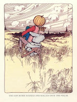
There are various sizes of illustrations on the left and right pages of the book, including: small black and white pictures integrated into the paragraphs, small vignettes that introduce each new chapter, full black-and white plate picture outlined with a black boarder, and 16 colored plates with a black border. The idea of having color added to each page was a new concept, and color was very expensive to print. Therefore, only a few plates are in color. Baum's dream was to have the entire book have added color for every illustration. Below are a few examples of the color plates with the thick black border. Underneath each large picture (color, and black and white) is the title of the scene.


New Characters
The Woggle-Bug and Ozma are new characters introduced in The Land of Oz. The Woggle-Bug is an insect that enjoys puns. Ozma is the rightful ruler of Oz, who was hidden by the Wizard of Oz (See title post).


All of the drawings were done in pen and ink.
American Fairy Tales 1901
Baum worked with several designers/illustrators in his time for the Oz books and other fairytale books. So there are many different types of illumination revived during the early 1900s. The Land of Oz book was originally published in 1904, so the current techniques that were using near this time was illumination, and other techniques.

Baum's work entitled American Fairy Tales (1901) was produced by the G.M. Hill company. The work was a collection of twelve fantasy stories by Baum, and it was published in 1901. The designer for the collection was Ralph Fletcher Seymour (American). The first edition of AFT had an unusual and striking design: each page was furnished with a broad illustrated border done in pen-and-ink by Seymour, which took up more than half the surface of the page, like a medieval illuminated manuscript (American). This probably reflected the influence of the medieval-revival book designs produced in the late nineteenth century by William Morris at his Kelmscott Press (See Printer post). It appears that the printed book of the Renaissance was being re-vived by a team of illustrators and calligraphers--"the medieval sctipt tradition were experiencing a revival" (Avrin p. 339)
Incipit/Explicit
 There are no chapter numbers to introduce the section. Each chapter is introduced with a drawing--a scene from the chapter. The drawing is done in black ink. For the title of the chapter, the font size is enlarged to appear bigger than the paragraph text. Each chapter is not outlined in a rectangle box, though, some chapters have different text format, as if Baum was experimenting with font-type. The text appears darker, in bold format. It also appears that there is larger text, or incipit, in the first letter of the title. The "T" is outlined in a square which gives the look of an old fairytale beginning (Once Upon a time...). The sizes of the title are inconsistent, possibly due to the layout of the illustrations above the text. Some chapters have smaller sized titles, and some chapters have titles that are bigger. The title is illuminated with graphics of the characters or landscape of the scene, so the size and space for the title must be coordinated with the illustration.
 The opening letter to the title is always larger then the rest of the title. Below is a picture of the title that has an outline of the letter "G" instead of a bold letter. The outline gives some embellishment, making the title appear more decorative than a bold letter. However, the book's chapter titles are inconsistent. The only consistency is the drawings that sit on top of the title. There is no explicit, however at the end of each chapter there is a small vignette picture that displays an illustration of the last action scene from the previous chapter.


No comments:
Post a Comment