From childhood experiences to cultural influences, Baum was a writer who was inspired by his changing environment. As a child, Baum learned about many fairy tales, but disagreed with the way they were told. He sought to develop a new type of fairytale, just as the world was changing. The early 1900s was an environment were many different dreamers brought their inventions to life, from Ford to the Wright Brothers, to the Colombian Exhibition, many people were motivated to create new ideas. This revolutionary way of thinking is represented in Baum's Oz books. It is a work that represents the advancements in technology, with major emphasis on color illustration. Publishers, of the period, could not visualize a book with color illustrations because they believed it would be too expensive. Although Baum knew how to print his own work, he still needed a publisher to produce copies of his work for the masses. Is it interesting to note that Baum and Denslow has to place their own money and supply their own printing plates for production. The publishers of the period only provided the distribution of books, which included ink and paper and the binding. The positioning of a title is important because it can suggest which edition of the book a person owns, especially when many copies are sold. The fact that Baum went through so many different publishing houses shows that they were popular business in the 1900s. Baum, as a writer, struggled with many people as he was preparing for his sequal. Between arguments about copyright laws with first illustrator Denslow, and publishing houses that were catering to other authors, Baum quickly learned about the publishing buisness. He learned never to shaare his rights, and to start with a new publishing company that would focus on his work. Learning about Baum's personal life, as well as the culture that surrounds him, provides different reasons for his depiction of women in the Land of Oz and the Oz series. Baum's work is important to American history and with the encouragement by children, he helped restore childhood fantasy literature. Through this book study, I learned that many elements go into the production of a book, such as printers, illustrators, authors, actors, composers, and filmmakers. The story behind the Land of Oz showcases a worldvirew, where characters go on a quest for thier own identity. This series bridges many diffrent generations, and it will always be a timeless classic for children.
Friday, April 20, 2012
Tuesday, April 10, 2012
Colophon
Colophon
The Land of Oz is a printed book, and the colophon is not located at the end of the book, but rather in the front of the book. The colophon includes everyone/place that was involved in the production of the book. The author's name L. Frank Baum, The illustrator John R. Neill, the publishing company The Reilly & Lee Co., the place of publication is Chicago, the comedians from the play version of The Wizard of Oz are mentioned as Montgomery and Stone, and the previous book title The Wizard of Oz is mentioned. The author's note includes the children who inspired Baum to continue to expand on characters and write another Oz story. These children can be included as part of the colophon. This is a record of information that highlights young readership of the 1900s. The fact that many children enjoyed Baum's stories suggests that there was a need for fantasy stories in America.
Each colophon is decorated by a boxed outline, which helps highlight the importance of the information. The copyright date is decorated using ink and pen, but the decorations include what appears to be a wallpaper designer, and small babies wearing glasses/goggles?. The babies have wet hands, and are playing with some stuff on the floor They look as if they are helping the wall designer post the advertisement for Baum's copyright date, but they are not dressed as a child would dress for cleaning. The children look prosperous, as they are wearing sailor dresses. One baby/toddler is reaching into a bucket, which could be water. The adult man is looking up at the sign, (including the copyright date and authors name) and is holding a brush.

On the author's note, there is an older child reading paper and sitting on top of mounds of letters. There is ink spilled below the page. This highlights the amount of letters that Baum must have received from children asking for him to continue writing stories. In the dedication page, is a pen-and-ink drawing of the scarecrow and the tin woodsman, played by two comedians David C. Montgomery and Fred Stone. This is showing simple gratitude from Baum, for their acting in the stage play of the Wizard of Oz. Why did only these two actors get a dedication from Baum? What about Dorothy's actress, or the cowardly lion? Baum's dedication page only focusing on Tin Woodsman and Sacrecrow could be a marketing strategy. Since the sequel focuses on the Tinman and Sacrecrow's further exploration, having them in the opening pages would set up the story.


Pagination/Collation/Rubrication
Oz Book Collector
Michael O. Riley is a collector, binder and book restorer who has analyzed and worked on a large number of copies of the Hill editions of the Oz books. In his book, A Bookbinder’s Analysis of the first Edition of The Wonderful Wizard of Oz (2011), he observes the Wizard of Oz (1904) printed book, and raises the question whether there could be some pattern to the manufacture of “mixed” copies, and what is the legitimate representation of the book at the point of production. There is no original “first edition” copy, so it is hard to compare additional copies to the real thing. How can a book collector determine whether his/her copy of the Oz book is closest to the original edition?
According to Riley, it has been hard to find an Oz book in mint condition, which is strange because it played a huge part in American history. There are no known copies to exist that are in perfect condition.The first edition of The Wonderful Wizard of Oz is extremely important to the history of the American children’s books. Nothing like it had been seen before: its innovative design literally changed the look of books for children. It is known as having an influence on children’s book design. The sequel continues the tradition of adding color to illustration, but there appears to be problems with binding due to this artistic idea, as discussed below.
The Wizard book was considered a “trade book”, and was bound largely by the usual methods used for trade books of the time. All Oz books were hardcover books.
The text block consisted of seventeen gatherings with numerous text illustrations in color, plus twenty-four (16 for Land of Oz) tipped-in, full-color illustrations printed on art paper somewhat thinner that that used for the text.
The gatherings were machine-sewn together (Smyth sewn).The Smyth sewn technique is where the signatures of the book are folded and stiched through the fold. The signatures are then sewen or glued together at the spine to form a text block. The problem with this technique is that the pages are not secure, and will become loose over time (Parisi, p. 8).
The spine was lined with mull (a heavily starched, cheese cloth-like material) with a paper strip over this; and cloth head and tail bands were glued onto the ends of the spine. The completed text block was then glued by the mull, and (unlike the usual trade method) by the first and last sheets of the text paper, into a pre-made cloth cover (Riley p. 9).
W.W. Denslow’s innovative design in Wizard of Oz , caused some slight deviations in the text block from the trade book norm. The physical books of the period were non-standard size—being shorter and squarer than was common—and their lack of separate inserted endpapers. (Riley, p.9)
The height of the text pages (8 3/8 after trimming) meant that the Smyth sewing matching was unable to be set to sew as many stitches as it would on a standard sized volume. Wizard fell just short of the book height that could be sewed on five locked stitches. In other words, the fifth stitch could not be completed, and this left the bottom inch-and –a-half of the spine unsupported by sewing.
One of the most common ways to hold a book open for reading aloud is to hold it at that point of the spine. However, the bindings of the Oz books appear to be weaker, so they would be less sturdy with wear.
The usual trade book contained separate endpapers made of a heavier weight paper than that used for the text; and although this fold of paper was glued to the text block only along its fold, its presence did help relive stress on the weaker text paper. The Hill edition instead used the first and last text pages as the endpapers, again slightly weakening the binding. Riley believes this may have been Denslow’s decision because it allowed him to begin his design for the book on the front paste-down and to carry that design through to the last visible page, the rear paste down. When readers open the book they see the grey and black picture of the Cowardly Lion on the left and a blank page on the right, the. (Riley p.10)
The Wizard book was printed on heavy paper—too heavy for the standard method of case binding—and so, over time gravity has cause the text block in most copies to sag and loosen from the case (10). The text sheets were printed in an arrangement that caused the gatherings to be folded against the grain. The grain in Wizard runs from the gutter to the force edge rather than from the top to bottom. Because the pages do not bend as easily as they might, every turn of a page puts extra strain on the spine glue and the sewing.
WizardMost trade books of the time had gatherings folded against the grain (Riley, 10).
The book's unusual dimensions (large format) caused a problem for the standard sewing machines and made the spine connection weaker at the bottom. In order to keep the colored illustrations from showing through the paper, a heavier text paper was needed. The illustrations were in great detail, so the color plates had to be printed on coated paper and were used as inserts. This is why many Oz books need repair work or restoration.
Pagination/Collation for Land of Oz
Inserted Title Page: Hand-lettered within a double rule border
Collation: I-I6/8, 17/4, 264 pages printed in black and white. Leaf measures 8 3/8 by 6 3/8 inches, all edges trimmed and stained yellow.
Pagination: Board lining paper printed with an illustration of the tin man and scarecrow. Publishers advertisement, introduction, copyright notice, list of chapters, dedication, subtitle for board lining paper.
Illustrations: Multiple text illustrations.
Binding: Light orange cloth, stamped in the red and green on the front, back, and spine. Cloth head and tail bands are attached to the spine ends. The spine reads from top down: The/ Marvelous/Land/Of Oz, Baum, and illustration of General JinJar and publisher Reilly and Lee.
Publication Date: July 1904
Page Layout
Page Layout
After the title page and the dedication page, there is a "List of Chapters" page. Today we use chapter numbers to indicate which section of the book we are reading. This book provides a list of chapters, but the chapters are not numbered from 1 to 24. Instead, the chapter titles are presented, and the page number where the chapter begins is present. Along the right side of the "List of Chapters" is a gallery of images of the main characters in the book, including: Tip, Jack, Mombi, Sacrecrow, Tin Woodman, Woggle-Bug and Bump. This image presentation is a creative way to show readers what characters they can expect to read about in the story. The fact that the book does not include chapters, suggests that readers would have to rely on images and titles of stories to remember which chapter they are reading. Perhaps, people referred to the page numbers as the chapter starter. Today we number our chapters, and include page numbers. Although to include a chapter number would interfere with the illumination of the text, and the incipit of the title. There is a title heading that remains on each page for that particular chapter. This heading is underlined with a thick black line. This is helpful for readers to remember which chapter they are reading.


Friday, April 6, 2012
Printer's Device- Type
Printer's Device- Type
As mentioned, Morris influenced the way books were printed and designed in Europe and America in the early 1900s. In the work, A Note by William Morris on his Aims in Founding the Kelmscott Press, William Morris recounts his printing techniques beginning with inspiration then his printing process.
"I have always been a great admirer of the calligraphy of the Middle Ages, and of the earlier printing which took its place. As to the fifteenth century books, I had noticed that they were always beautiful by force of the mere typography, even without the added ornament, which which many of them as so lavishly supplied. And it was the essence of my undertaking to produce books which it would be a pleasure to look upon as pieces of printing and arrangement of type. I had to consider chiefly the following things: the paper, the form of the type, the relative spacing of the letters, the words, and the lines, & lastly the position of the printed matter on the page. It was a matter of course that I should consider it necessary that the paper should be hand-made, both for the sake of durability and appearance" (Cockerell, p. 4).
Morris came to several conclusions when deciding how he would print, and the following points is an outline of his printing methods:
1.) Hand-made paper: wholly of linen ( In Morris' day hand-made papers were made of cotton)
2.) Hard linen that is well sized, and laid, not woven
3.) Type: Roman type
4.) Spacing
5.) Position of printed matter
The Roman type does not have any embellishments, which would make the wording easier to read. In comparing roman type to modern type, Morris believed that the letter shape should be solid, without the thickening and thinking of the line, and not compressed laterally,because it is difficult to read that way.
An example of the perfect Roman type is taken from Venetian printer of the fifteenth century: Nicholas Jenson (1470-1476). Below is Jenson's work from Laertius, printed in Venice, 1475 (Britannica).

As Morris practiced writing the Roman script, he noticed that his lower-case appeared more Gothic than Jenson's.In this case, Morris decided to design a new type that would make Gothic text more readable, then it had been before. Inspired by Chaucer's double columned book, Morris created a smaller-sized Gothic type of Pica size.Morris type was designed in 1892, and he named it the Golden type (13). The font consisted of eighty--one designs, including stops, figures and tied letters. Each type was punched out, and an retired master-printer named William Bowden acted as compositor & pressman. Below is a picture of Morris' Golden Type.

For spacing, the face of the letter should be level with the body, as to avoid white spaces between the letters. The spaces between the words should be no more than is necessary to distinguish the division into words. In other words, the spaces on all sides should be equal.
The position of the print on the page should always leave the inner margin the narrowest, the top wider, the outside edge wider still, and the bottom widest of all. This is a medieval rule used by medieval books. Morris' modern printers disagree with the idea to leave margin space because they believe that "the unit of a book is not one page, but a pair of pages" ( Cockerell, p.8) The idea of spacing and position are important features of a book, because the positioning of words can make the book more readable, or appealing to the eye.
Printer(s)
Printer (s)
There is no indication, printed in the book, that The Land of Oz was actually printed by William Morris’ Kelmscott press, but it was the most popular printing press of the time and Morris' theories revolutionized book production and typography in both Europe and United States in 1894. L. Frank Baum would be familiar with the socialist’s issues, as well as Morris’ Arts and Crafts Movement, that was popular in late nineteenth century. There were many arguments made concerning the capitalist system.
Paperback Books 1831
In the United States, the first series of paperback editions appeared in 1831. They became extremely successful after 1870. By 1885, a third of the books published were a type of popular paperback called "dime novels" because they originally cost 10 cents (Ellenbogen p. 468). The mass production of paperback books led to a decline in quality. Publishers printed many books on cheap paper. Bindings were often poorly glued, and they broke. Paperback books are an example of the kind of book production and quality that took place in the late 19th century, just before Baum published his Oz series.
William Morris- 1834- 1934
 William Morris was an English poet, book designer and craftsman that led the movement for restoring the quality of printed books. Morris had always been interested in the problems of book production and longed to return to the days of the illuminated manuscript. As a book designer, he believed that the best work was always done by hand. Throughout the nineteenth century, Morris saw the history of printing as declining rapidly. In 1889, Morris worked under a printer and Socialist named, Emery Walker, and began studying the craft of printing (Wilmer, p. xxi). In 1891, Morris started producing books, in which he designed and printed fifty-two volumes, by hand, including Ruskin’s The Nature of Gothic, and the Kelmscott Chaucer. The Kelmscott is noted as the most beautiful of all printed books.
 Morris is known as the greatest European pattern designer since the end of the Middle Ages, because he revived the long-forgotten crafts and skills from the Middle Ages. He was successful in learning thirteen fields of decorative art including: stained glass, ceramics, painted or stenciled decoration, embroidery, wallpapers, chintzes, printed fabrics, tapestries, carpets, illuminated manuscripts, typography and book design (Wilmer, ix). His concern extended beyond the methods of design and production to his raw materials themselves: dyes, papers, inks and so on (see Printer Device post). However, he became a major authority on textile design in medieval Europe and the Middle East, as well as on illuminated manuscripts and early printed books (Wilmer, p. ix). After becoming an expert on Medieval typography, Morris wanted to motivate a happier society through the satisfactions of creative work (Wilmer, xxii). Morris seems to be the twentieth-century-scribe, who believes that hand-made materials will promote greater happiness then a machine produced copy, such as the paper back. The only problem with Morris’ theory is that he is not considering the poor population. Hand-made books take time to make. In this case, they are generally more expensive than a machine-produced copy. More people will have access to books if they are mass produced by a machine, even if the quality is bad. Handmade items would only be available to those who could afford to buy them, such as the wealthy. Morris tries to modernize an old tradition, in bringing back the idea of scribes, but it would not work in a technologically advanced society. At least with machines the poor would have some chance of reading. Despite the theory on handmade items, Morris’ design methods influenced many publishing companies.
Kelmscott Press (1890)
In 1890, William Morris created his own publishing company called the Kelmscott Press. The press was founded based on the principles of the Arts and Crafts movement. For Morris, a machine's techniques in printing lowered the standards and quality of books, and machines were developed for mass market sales. By establishing the Kelmscott Press Morris revived the Renaissance typography and book design for the twentieth-century. Morris believed that a book is a piece of architecture, each detail should contribute to the whole, so that the paper, the ink, the type-cases, the word and line spacing, the placing of the margins and the integration of illustration and decoration all had to be considered in detail, and in relation to the complete book (Naylor, p. 111). In 1890 Morris and friends established the Kelmscott Press near London. They designed and used styles of type similar to those in incunabula. They printed books on handmade paper and binding and decorated them by hand. Other printers also worked to improve thier product. Type designers such as Rudolph Koch in Germany and Fredric Goudy in the United States developed legible and beautiful types. The Kelmscott Press was Morris' interpretation of how he thought books should look. Books should be created to give pleasure to the reader based on the look and feel of the book.The combination of appearance and structure is what revolutionized book production and typography from Europe to the United States. Morris' theory on proper bookmaking inspired private presses in England, including the "Art Nouveau book" (decorative style) and decorative experiments in the 1890s. Morris layed down the foundation for good typography, as well, which many press companies individualized.
Arts and Crafts Movement
The idea of machine being a normal tool for civilization was not easy to grasp for society in the early twentieth century. Industrialization had brought total destruction to the purpose and meaning of life. Morris and his followers within the Arts and Crafts Movement saw the uncontrolled advance of technology as a threat to man’s spiritual and physical well-being, but at the same time had no clear understanding of the new industry (Naylor, p. 9). The issue seems to be that machines would be used to increase production and workers would have to work harder. Morris’ theory is contradictory because with machines it would produce more copies faster, which would allow many people to have access to people. For British idealists, mechanical progress equaled human misery and degradation. The destruction of human values were reflected in poverty, overcrowded slums, grim factories, and a dying countryside. For Morris, “men living amidst such ugliness cannot conceive of beauty, and therefore, cannot express it” (Naylor 8). The problem with industrialization would be the exploitation of the many for the profit of the few. Morris believed in a revolution , as well as other radicalsts within the design projection. By joining the cause, Morris inspired each designer to establish their own craft doctrine, which would prepare the way for Art Nouveau (creative artwork). In the movement, Morris came to the realization that machinery does not have to be a destructive force. Many designers worked for industries that supported programs for the improvement of industrial design standards.
Type Face
When the press was started the idea of having decorative features in a book was a fantastical idea. In 1888 Morris turned his attention away from manuscripts and into typography. Morris wanted to design a special type of his own in 1889 using the methods of the early printers. In 1890, Morris and friends established the Kelmscott Press near London. They designed and used styles of type similar to those in incunabula. They printed books on handmade paper and binding and decorated them by hand. Other printers also worked to improve their product. Type designers became popular in Europe and the United States, and the idea was to develop legible and beautiful types for readers.
Morris shows how important it is to learn the old ways of art, even when there are new developments in technology. Morris's ideology filtered to the United States, and since he was popular in 1900s it is an assumption that he influenced the typeset of The Land of Oz book.
Illumination and Incipit
The look and feel of Children's books is starting to change with the Oz books.
Illumination
The second book of the Oz series, Land of Oz does not include Dorothy, or the Cowardly Lion, but it introduces many of the major characters who appear throughout the rest of the Oz series. In other words, The Land of Oz revises the history of Oz to include a new wizard and to get Ozma (Tip) into the framework for the continuing stories. The first title used is The Marvelous Land of Oz: Being an Account of the Further Adventures of the Scarecrow and Tin Woodman. In this adventure, new characters are introduced. Illumination--The Land of Oz (1904)
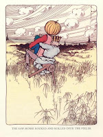
There are various sizes of illustrations on the left and right pages of the book, including: small black and white pictures integrated into the paragraphs, small vignettes that introduce each new chapter, full black-and white plate picture outlined with a black boarder, and 16 colored plates with a black border. The idea of having color added to each page was a new concept, and color was very expensive to print. Therefore, only a few plates are in color. Baum's dream was to have the entire book have added color for every illustration. Below are a few examples of the color plates with the thick black border. Underneath each large picture (color, and black and white) is the title of the scene.


New Characters
The Woggle-Bug and Ozma are new characters introduced in The Land of Oz. The Woggle-Bug is an insect that enjoys puns. Ozma is the rightful ruler of Oz, who was hidden by the Wizard of Oz (See title post).


All of the drawings were done in pen and ink.
American Fairy Tales 1901
Baum worked with several designers/illustrators in his time for the Oz books and other fairytale books. So there are many different types of illumination revived during the early 1900s. The Land of Oz book was originally published in 1904, so the current techniques that were using near this time was illumination, and other techniques.

Baum's work entitled American Fairy Tales (1901) was produced by the G.M. Hill company. The work was a collection of twelve fantasy stories by Baum, and it was published in 1901. The designer for the collection was Ralph Fletcher Seymour (American). The first edition of AFT had an unusual and striking design: each page was furnished with a broad illustrated border done in pen-and-ink by Seymour, which took up more than half the surface of the page, like a medieval illuminated manuscript (American). This probably reflected the influence of the medieval-revival book designs produced in the late nineteenth century by William Morris at his Kelmscott Press (See Printer post). It appears that the printed book of the Renaissance was being re-vived by a team of illustrators and calligraphers--"the medieval sctipt tradition were experiencing a revival" (Avrin p. 339)
Incipit/Explicit
 There are no chapter numbers to introduce the section. Each chapter is introduced with a drawing--a scene from the chapter. The drawing is done in black ink. For the title of the chapter, the font size is enlarged to appear bigger than the paragraph text. Each chapter is not outlined in a rectangle box, though, some chapters have different text format, as if Baum was experimenting with font-type. The text appears darker, in bold format. It also appears that there is larger text, or incipit, in the first letter of the title. The "T" is outlined in a square which gives the look of an old fairytale beginning (Once Upon a time...). The sizes of the title are inconsistent, possibly due to the layout of the illustrations above the text. Some chapters have smaller sized titles, and some chapters have titles that are bigger. The title is illuminated with graphics of the characters or landscape of the scene, so the size and space for the title must be coordinated with the illustration.
 The opening letter to the title is always larger then the rest of the title. Below is a picture of the title that has an outline of the letter "G" instead of a bold letter. The outline gives some embellishment, making the title appear more decorative than a bold letter. However, the book's chapter titles are inconsistent. The only consistency is the drawings that sit on top of the title. There is no explicit, however at the end of each chapter there is a small vignette picture that displays an illustration of the last action scene from the previous chapter.


Subscribe to:
Posts (Atom)