Printer's Device- Type
As mentioned, Morris influenced the way books were printed and designed in Europe and America in the early 1900s. In the work, A Note by William Morris on his Aims in Founding the Kelmscott Press, William Morris recounts his printing techniques beginning with inspiration then his printing process.
"I have always been a great admirer of the calligraphy of the Middle Ages, and of the earlier printing which took its place. As to the fifteenth century books, I had noticed that they were always beautiful by force of the mere typography, even without the added ornament, which which many of them as so lavishly supplied. And it was the essence of my undertaking to produce books which it would be a pleasure to look upon as pieces of printing and arrangement of type. I had to consider chiefly the following things: the paper, the form of the type, the relative spacing of the letters, the words, and the lines, & lastly the position of the printed matter on the page. It was a matter of course that I should consider it necessary that the paper should be hand-made, both for the sake of durability and appearance" (Cockerell, p. 4).
Morris came to several conclusions when deciding how he would print, and the following points is an outline of his printing methods:
1.) Hand-made paper: wholly of linen ( In Morris' day hand-made papers were made of cotton)
2.) Hard linen that is well sized, and laid, not woven
3.) Type: Roman type
4.) Spacing
5.) Position of printed matter
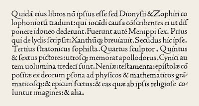
The Roman type does not have any embellishments, which would make the wording easier to read. In comparing roman type to modern type, Morris believed that the letter shape should be solid, without the thickening and thinking of the line, and not compressed laterally,because it is difficult to read that way.
An example of the perfect Roman type is taken from Venetian printer of the fifteenth century: Nicholas Jenson (1470-1476). Below is Jenson's work from Laertius, printed in Venice, 1475 (Britannica).
As Morris practiced writing the Roman script, he noticed that his lower-case appeared more Gothic than Jenson's.In this case, Morris decided to design a new type that would make Gothic text more readable, then it had been before. Inspired by Chaucer's double columned book, Morris created a smaller-sized Gothic type of Pica size.Morris type was designed in 1892, and he named it the Golden type (13). The font consisted of eighty--one designs, including stops, figures and tied letters. Each type was punched out, and an retired master-printer named William Bowden acted as compositor & pressman. Below is a picture of Morris' Golden Type.
For spacing, the face of the letter should be level with the body, as to avoid white spaces between the letters. The spaces between the words should be no more than is necessary to distinguish the division into words. In other words, the spaces on all sides should be equal.
The position of the print on the page should always leave the inner margin the narrowest, the top wider, the outside edge wider still, and the bottom widest of all. This is a medieval rule used by medieval books. Morris' modern printers disagree with the idea to leave margin space because they believe that "the unit of a book is not one page, but a pair of pages" ( Cockerell, p.8) The idea of spacing and position are important features of a book, because the positioning of words can make the book more readable, or appealing to the eye.


So happy to support your organization.
ReplyDeleteBook printer